This week Wednesday marked National Grammar Day and, comic book fan that I am, I recognize this as a moment to highlight the grammar of graphic novels. Like me, you may have run into folks who still need to be convinced that comics have literary value. Never fear! There are scholars out there investigating the brain science behind sequential art, going back to the seminal text Understanding Comics: The Invisible Art by Scott McCloud.
First, let’s establish what “grammar” is; the Britannica high school edition gives this definition:
“A common contemporary definition of grammar is the underlying structure of a language that any native speaker of that language knows intuitively. The systematic description of the features of a language is also a grammar. These features are the phonology (sound), morphology (system of word formation), syntax (patterns of word arrangement), and semantics (meaning).”
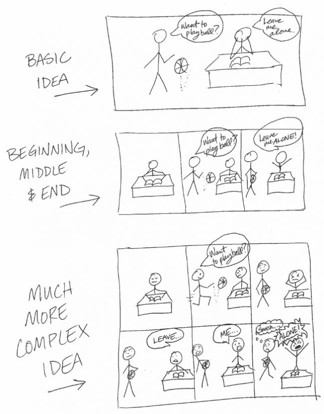
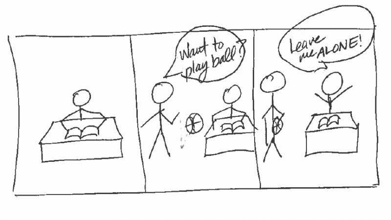
Because most of us have read a newspaper, you are probably familiar with the underlying structure of a comic strip – a sequence of visual images with a beginning, middle and end. Each self-contained image is called a panel. Here in the United States we take in these panels in a left to right, top to bottom of the page sequence. A sequence of panels with a beginning, middle and end is equivalent to a sentence or a paragraph, and the length can vary, just like with prose. Comics like The Far Side, one of my favorites, can convey a complete idea in one panel – with a single image – and many of the Sunday comic strips use three or four panels to give a complete idea or story.
Graphic novels, in particular, give a creator the space and the pages to include even more nuance than comic strips. A beginning, middle and end sequence can employ more than three or four panels; it can take up multiple pages! This allows clauses, which in comics are panels that add pauses, panels that clarify ideas or action, and panels with asides (such as jokes and tangents). Psychologist Neil Cohn discusses how these features work together in his book The Visual Language of Comics:
“Comic strips do, after all, have the basic structure of language, with a hierarchy of elements that can be combined with infinite variety. The building blocks of this hierarchy are a "visual vocabulary" of signs and symbols. That might include speech bubbles, motion lines, or stars to represent the throw of a punch.” (The Guardian, 11/23/13)
The grammatical features of comic book language – sound, word formation, arrangement and meaning – are also probably familiar, if you have read the Sunday funnies. The font that is used, its size, and how it is emphasized (underlining, bold, italics, capitals, etc.) help us to determine if a character is talking at a normal volume, yelling or whispering. Facial expressions, context clues, and action lines will help with understanding how to intone or stress one word (or panel) over another. A thought can also be broken up over multiple panels, so that there is one word of text in each panel.
I could go on, and get even more academic, but suffice to say there is a lot going on – that is, there is a lot to READ – on the pages of a comic book or graphic novel. They are great for guided reading, read alouds, and even “diagramming sentences”. And so, in closing I gift you with a few panels in my preferred medium (stick figures!) to show how the elements of comic grammar can be employed to create nuance. Try to identify the phonology, morphology, syntax and semantics. You may surprise yourself!

For more information, click here to download Scholastic's resource from Graphix: A Guide to Using Graphic Novels with Children and Teens

Deimosa Webber-Bey


